Proper Colored Pencil packaging design and Branding
This project was an exercise in branding, and packaging design. I wanted to go for a high quality colored pencil manufacturer. I after choosing the product, I came up with a custom logo, name and color scheme.
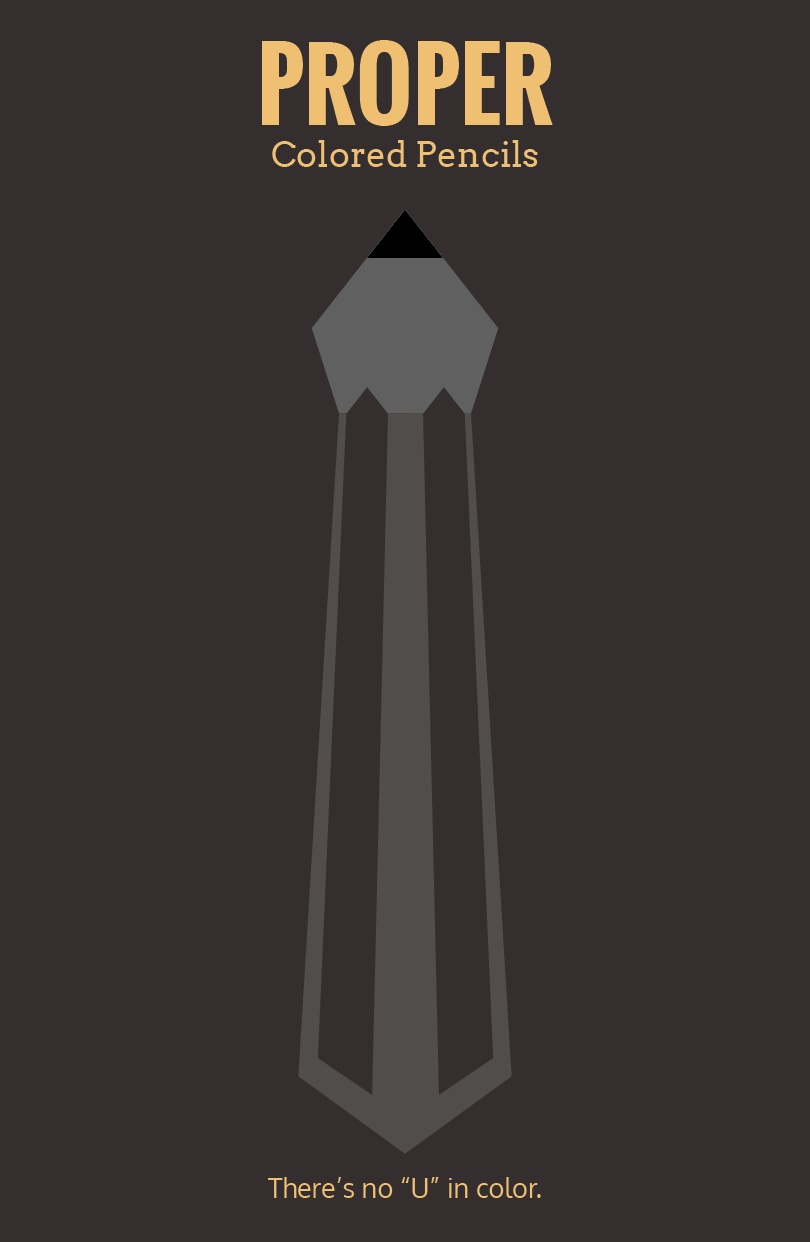
Above is the vertical logo along with the company tagline. The ficticious company I made was called Proper Pencil Company. They are an american company that makes all their pencils in the U.S. The company message also plays with the alternate spelling of color which explains the 'no U in color' tagline.

Above is the logo mark without the text. I really like the logo because it works even if it's flipped upside down. In it's current position, it resembles a tie to reinforce the proper quality of the product, and when viewed upside down, it more resembles a pencil face down ready to draw. You see regular logo orientation when the package is closed, and you see the upside down version when the box is folded into easel mode.
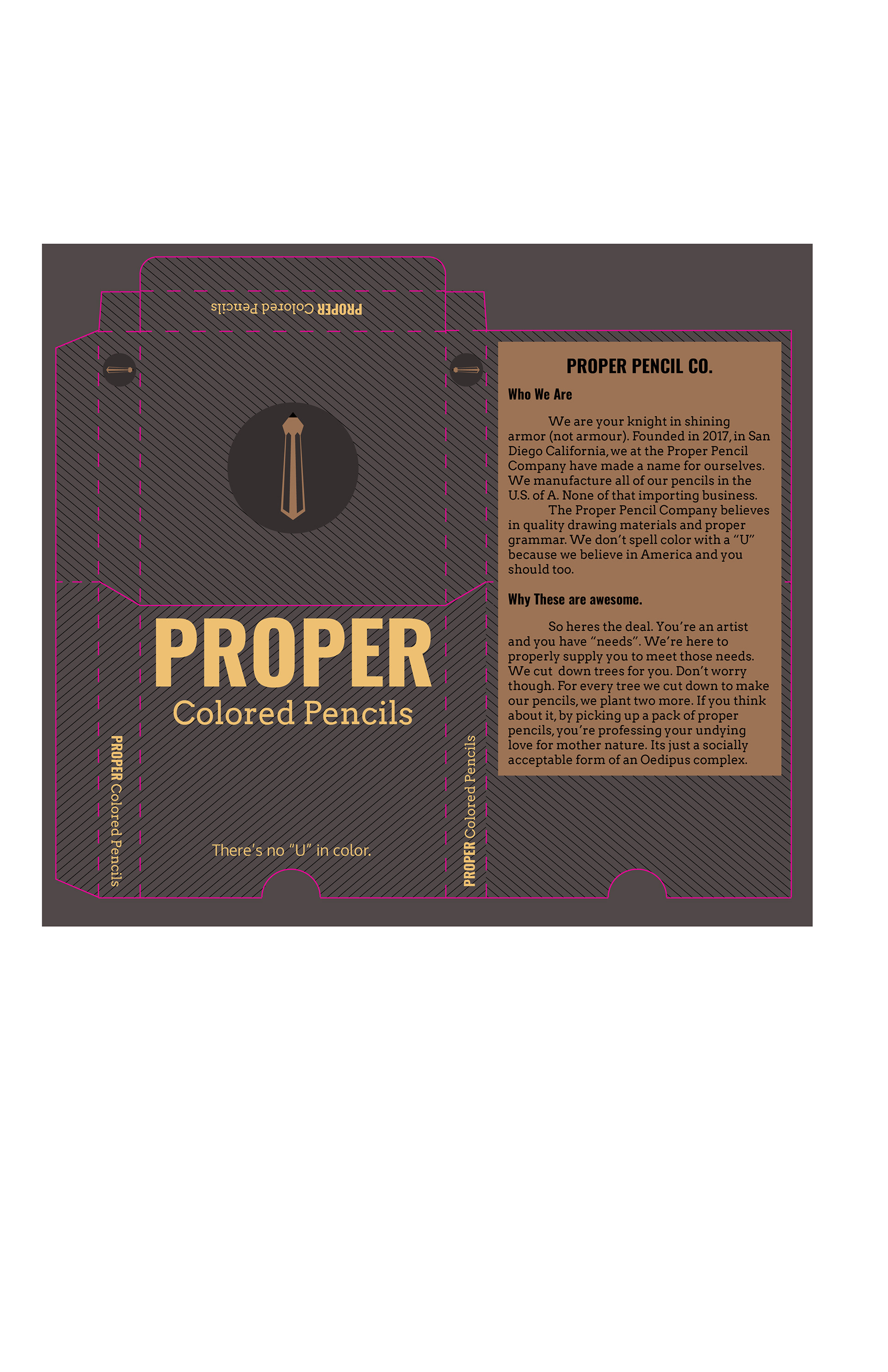
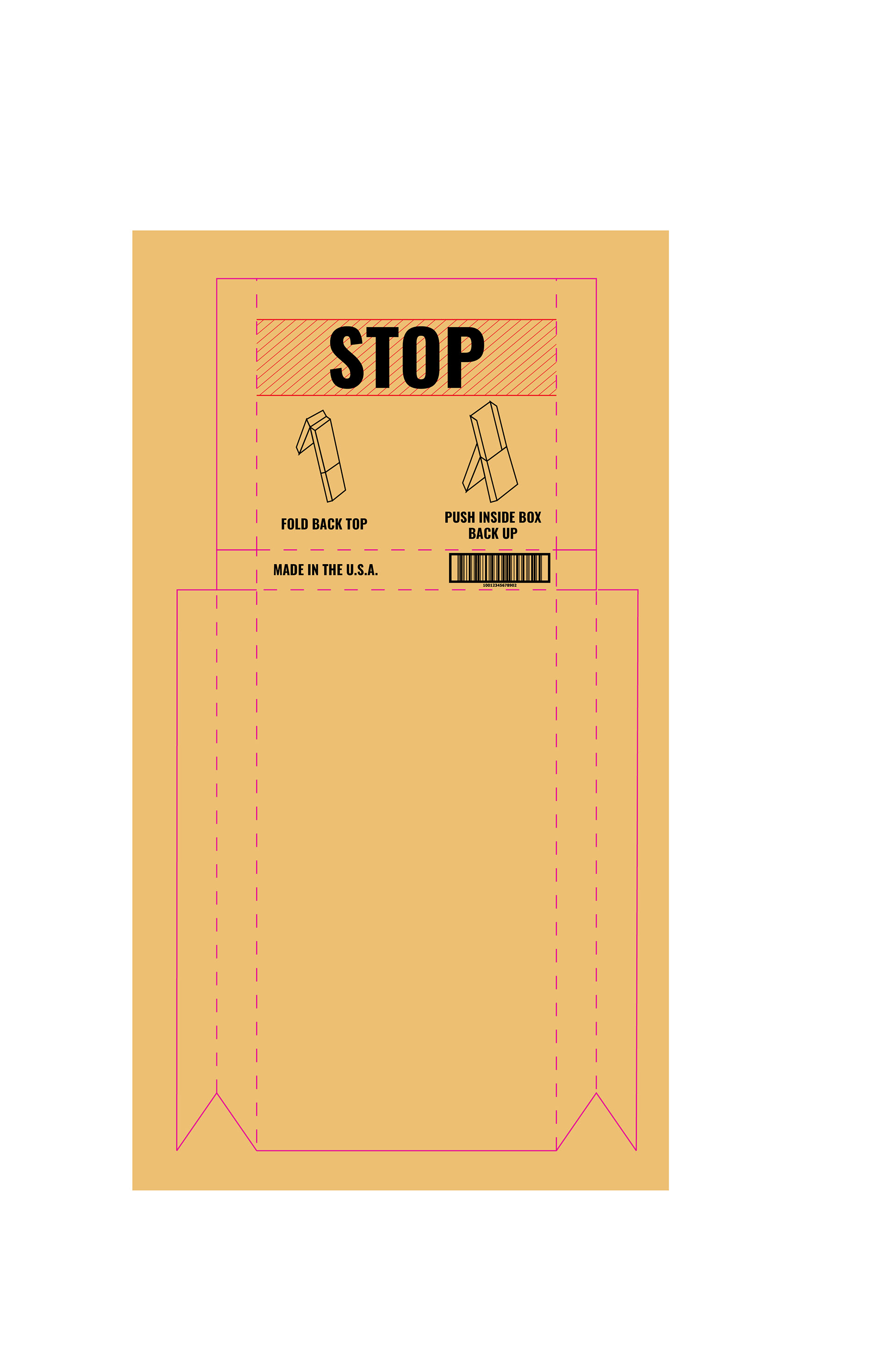
Above and below are the die-strikes that I created to make the package work as an easel. The above example is the outer box, and below is the inner box which houses the pencils.
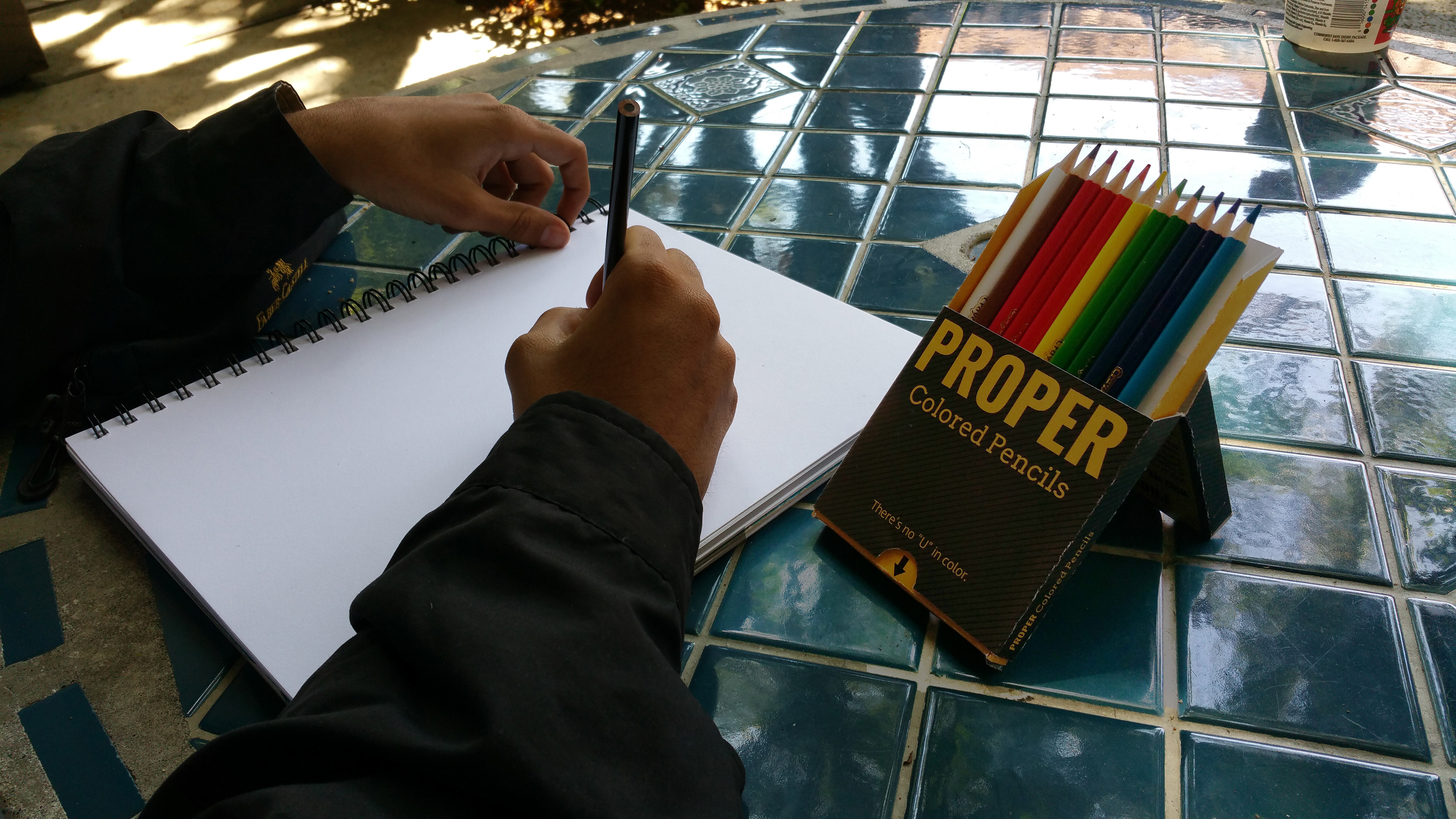
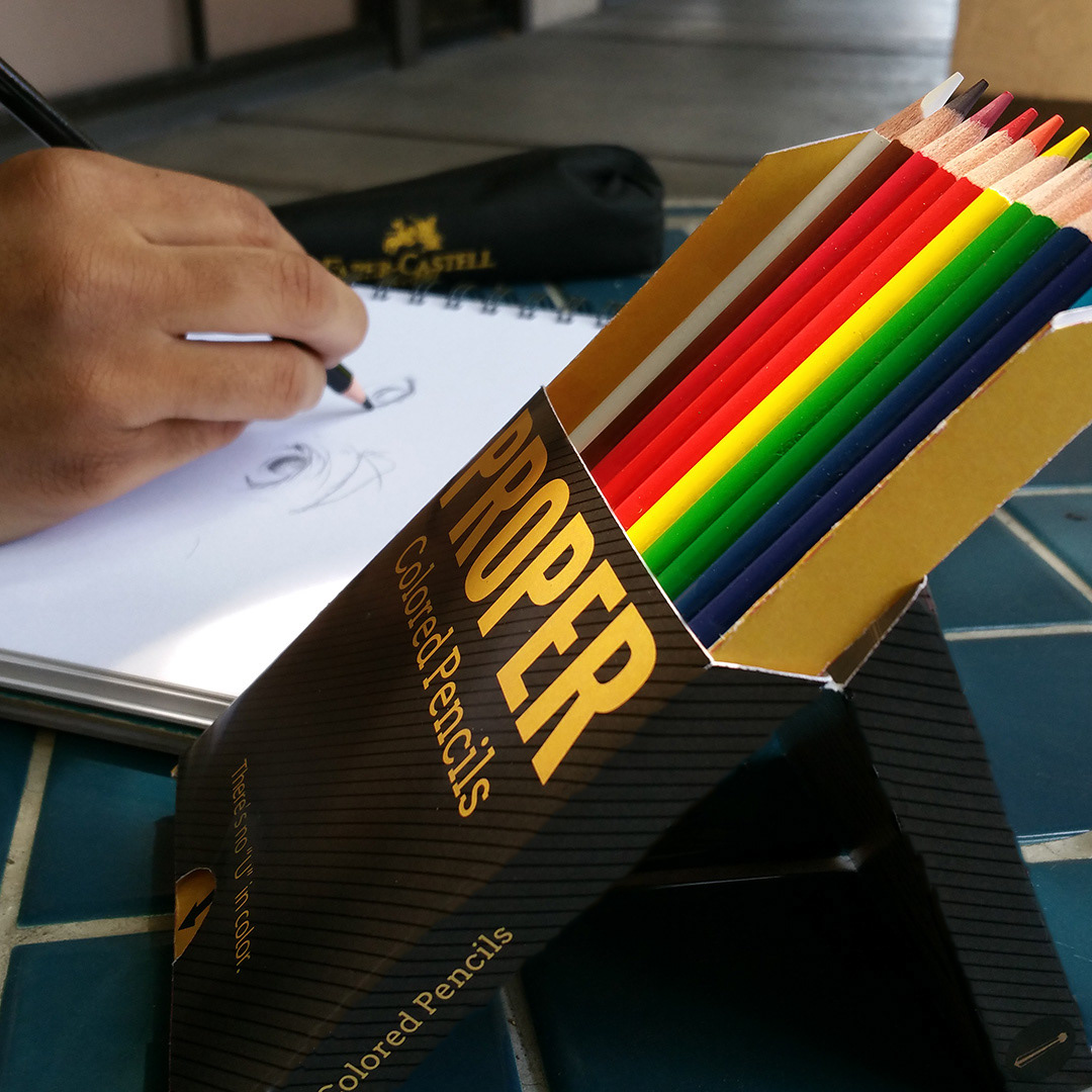
OPTION 1: Pencils in use with the easel positioning.

OPTION 2: Standard opening of the pencil box.
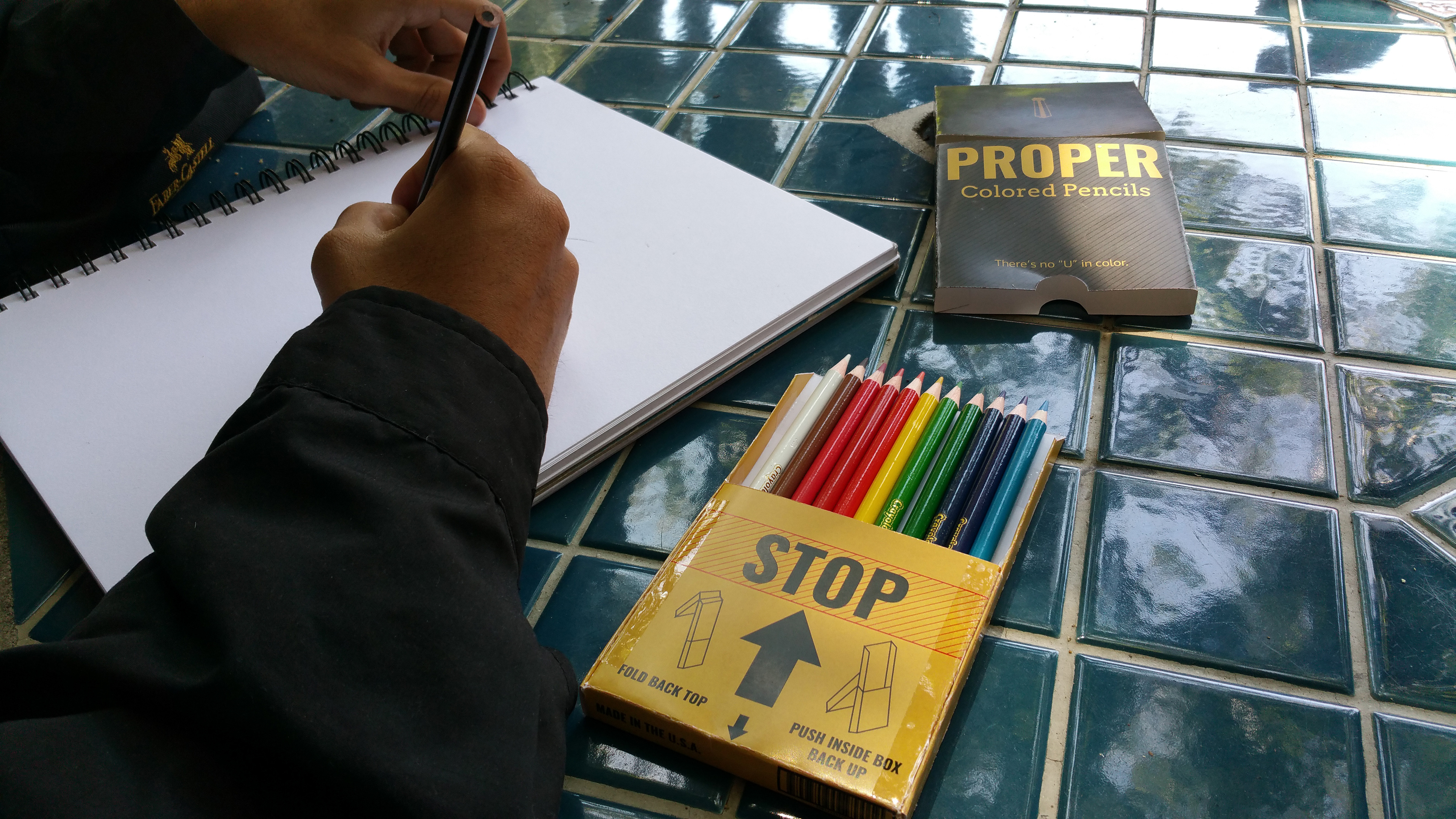
OPTION 3: The last option to open the package is to completely slide out the inner tray and use the colored pencils this way. Both option 1 and option 2 allow you to see which pencil you are actually reaching for.